Design Advice
Design With Contrast
For many homeowners and designers, their goal is to create spaces that are exude visual harmony, using cohesive hades that not only work well together but exist in similar colour scales – never straying too far away from the other. It’s important to do what works best for your own space, but also not to shy away from colour combinations that give a more high impact effect than anything else. Not every space will call for this, but the contrast does create a high glam look that can be very striking when executed correctly. In living spaces, you can use each colour you have in mind in small doses – creating a main colour and accent colour dynamic while in spaces like bedrooms and even bathrooms, you shouldn’t shy away of using both shades in equal amounts. Here are just a few combinations & tips that you should try to design a great high contrast space.
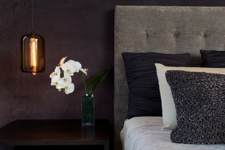
Blues & Blacks
Black & blue might make scare some away, but these are great shades that can play well of each other in the right spaces. Deep blue shades work well with black because of how unexpected the pairing is, and the blue helps the space not get too “heavy”. Adding white into the mix is also a great addition. Of course, it’s all about having the right undertone for the blue you’re using to pair with black. Both of these colours work best when using them in lush fabrics with plenty of texture.
Layering
It’s not always enough to just put two shades next to each other and expect them to work, it’s all about creating a story with your design. Colours in multiple materials or fabrics can add a whole new dimension, as well as the inclusion of more natural colours and materials like rustic wood – which can work well with combinations like navy blue and white to create a nautical feel. These colour contrasts can so often tell a story, so it’s important for you to figure out what that is.
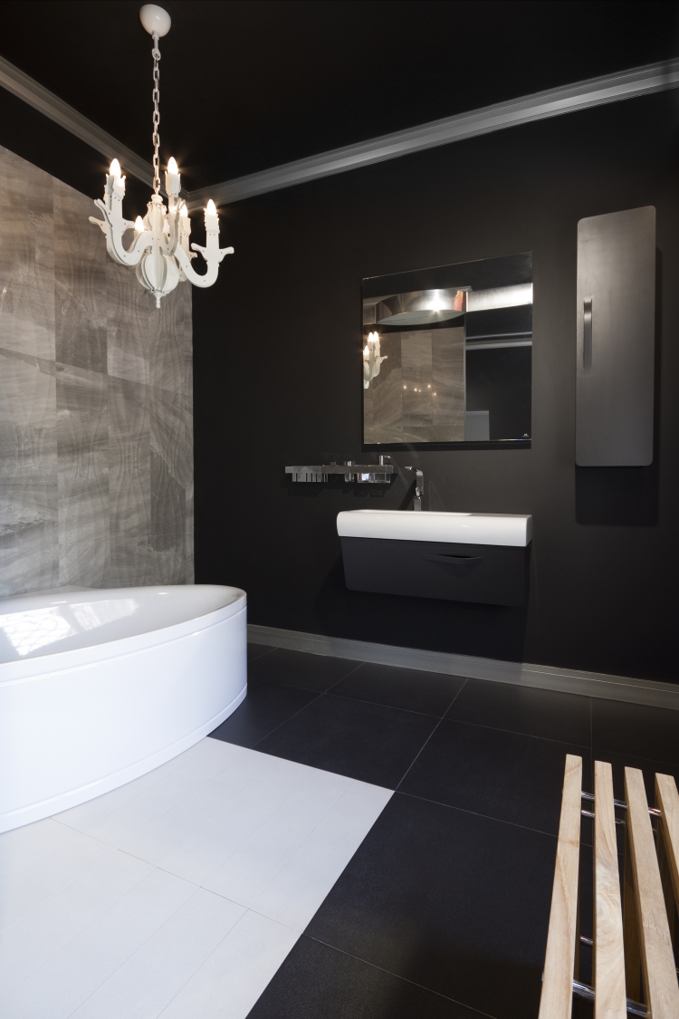
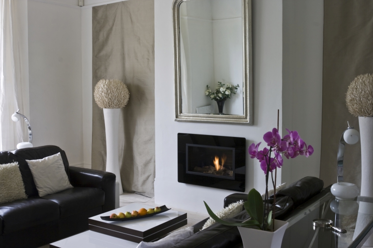
Black & White
This is the go-to when trying to create a high contrast space and for good reason: it’s a timeless and easy combination of colours. Whether you go with classic stripes, unique patterns or any other way to put these two colours together, it’s a combination that works virtually anywhere. It’s important to know what other colours you might want to use along with the black & white without throwing it off – and how the best way to inject it is. Think bright colours, bold patterns and a plethora of metallic shades and accessories from chrome to rose gold.
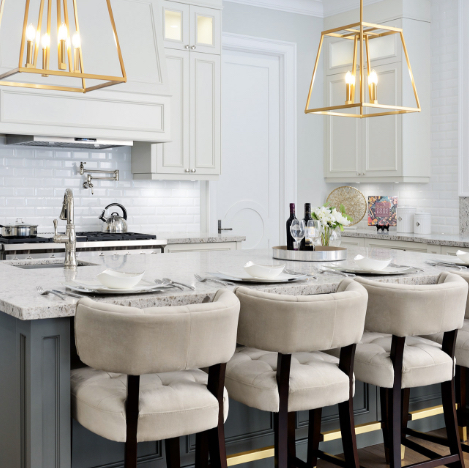
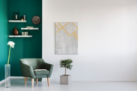
Neutral Versus Bright
While neutral colours like grey are popular in home design, they are excellent when used alongside bright and bold shades like reds and turquoise to bring everything together. The neutral colour can serve as the “base” of your look, and can include colours like white and various shades of beige. You then have the freedom to use it alongside smaller quantities of a brighter and bolder hue, typically in the form of furniture, accessories, textiles and more to offset the look of the neutral shade.
SUBSCRIBE TO OUR NEWSLETTER
VIEW LATEST ISSUE