Design Advice
Unlikely Colour Combinations That Work Wonders
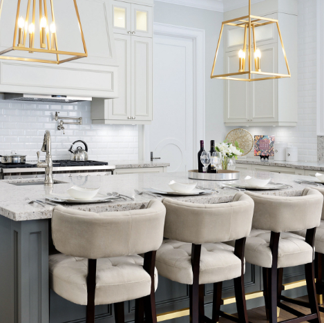
 For many homeowners, sticking to more neutral colour combinations makes the most sense in terms of keeping a space cohesive design wise, but that doesn’t always have to be the case. There are plenty of colour combinations that might seem unlikely to go together, that actually work much better than you would think. As much as we love elegant shades of grey with accent colours, there is plenty to be said for bold combinations of shades. When putting two colours together, the outcome will either be complete visual harmony and balance or a high contrast look. Depending on the space you’re looking to design, one or the other might be the best move. You always have to consider the undertones of the colours that you’re not going to end up with colours that really clash. Think about the mood or feeling you want to invoke in that particular space and go from there. Is it a room where you would prefer more visual excitement and stimulation, or will it be a space that’s much more relaxing and restful? These are considerations you’ll have to make before you can even begin to think about which colours do and don’t go together – and how you might be able to break the rules a little.
Green and Coral
This is a high contrast colour combination that works a lot better than you’d think. It calls back to a lot of natural aesthetics since they’re both colours that can be easily found in any garden. It might involved two bold shades, but it has a particular calming look when paired because of it’s floral appeal. Think of plush living spaces when using these shades together.
Olive & Mauve
These colour combinations lends itself to a much more sophisticated look, and can work well in nearly any space in the home. They work together well visually thanks to them both being warm shades and, as long as the undertones are similar, provide the kind of visual harmony that can make a space really come together.
Camel Beige & Canary Yellow
These are two colours that go together but aren’t necessarily on vastly different ends of the colour spectrum. These shades play well with each because of how close they are – not because of shocking differences. Still, this bright shade of yellow is typically paired with a colour with much cooler undertones or completely neutral – making camel beige an unlikely partner. Nevertheless, it’s a result that comes out as very elegant, since both shades are reminiscent of gold in their own ways. Putting these alongside gold metallic details is a great place to start.
Navy Blue & Black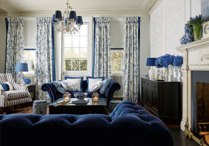
You don’t always see a colour pairing where both colours are dark, as most homeowners fear they will get lost in each other and neither will really stand out. Navy blue and black, however, are both dramatic enough to stand out on their own in a stunning and eye-catching way. It’s important to pick a blue that, while dark enough, is still easily distinguishable as different from the shade of black that you choose. If you feel it might get too heavy, throw white and gold accents into the mix to maintain a bit of balance.
SUBSCRIBE TO OUR NEWSLETTER
VIEW LATEST ISSUE