Blog
The Perfect Interior Colours For Fall
As the fall season gets into full swing, many homeowners are looking to make slight or large changes to their space to go along with the change. When we think of fall, there are a handful of colours that come to mind as well as the best places to use them. Whether it’s a new wall treatment or simply a change in accessories or textiles, these interior colours can do plenty to bring the spirit of fall into your home.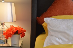
Orange
Orange immediately makes you think not only of fallen leaves, but alsop pumpkins and various spices. This is a great colour to use in living spaces or kitchens – essentially anywhere that a “warm” look and feel is the goal. It can be an overwhelming shade to use depending on how you use it and what kind of orange it is but it can be a great addition. Even something as simple as haven’t orange tinged lighting can make all of the difference in the world in your space.
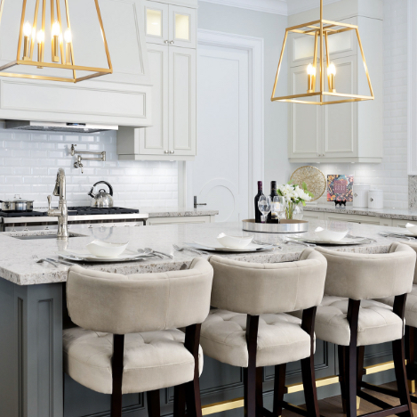
Grey
This might not seem like a “fall colour” right away, but it’s definitely a versatile shade that works well among other palettes. Consider this as the colour for your wall treatment and using other bolder and brighter accent colours alongside it. Keep in mind also, there is more than one variation of grey. There are some with warmer undertones – which is what you’ll be leaning towards for a fall feel. Think of ones with slight beige tones (or Greige as it’s been coined), and ones that are a bit darker, richer and exude plenty more warmth. Alongside other colours like red, orange and even brown – it can create the most perfect look in living spaces like family rooms and even dining rooms.
 Chocolate Brown
This is a colour that some homeowners might sometimes shy away from, but it’s a great colour to have around the house. Depending on where and how you want to us it, chocolate brown can add tons of dimension in almost any space in the home. In living rooms, they’re great for plush textiles and large, textured
furniture while they work as a great accent colour in a bathroom or bedroom. Dark and deep wood shades and plush textiles are the best ways to make use of the colour – not so much as a wall treatment or accessories shade. Think about the kind of comfort that chocolate itself is meant to invoke, and use that to understand how you should use the colour in your space!
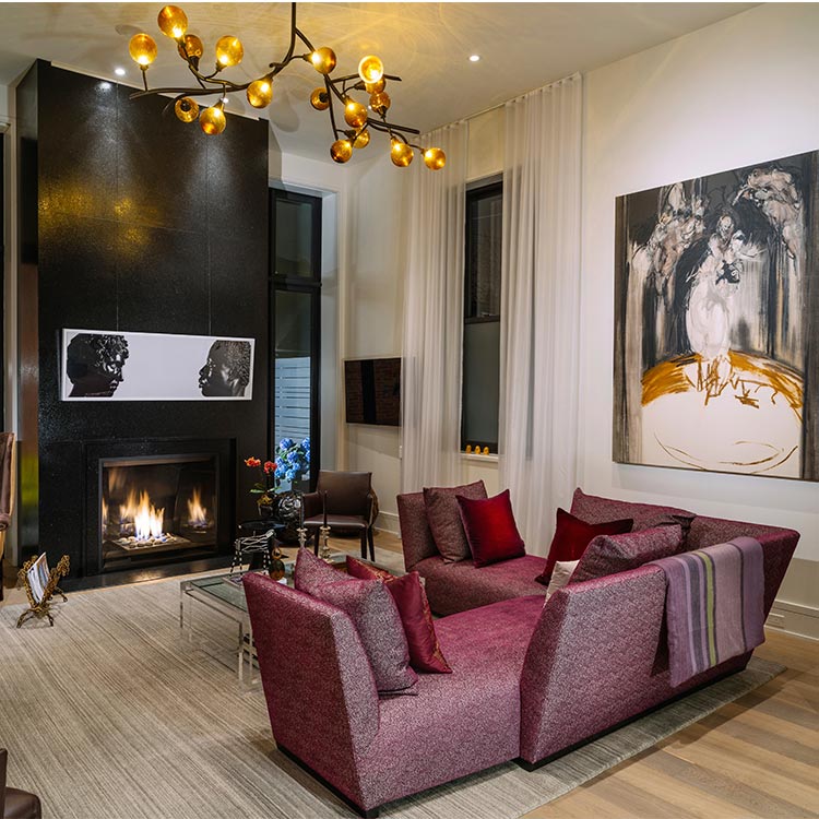
Red
Red is a great colour because it can carry you directly into the holiday season with no issues at all. From accessories to upholstery to furniture to art to accent wall treatments, red is a vibrant colour that literally works anywhere. Consider its contrasting colours or even just a neutral palette that it could work well with and pair them together. As an all-over wall treatment, it’s a shade that can be extremely overwhelming – not to mention the affect it sometimes has on our emotions in large quantities. Consider this as much of a “pop of colour” in a larger, much more neutral space.
SUBSCRIBE TO OUR NEWSLETTER
VIEW LATEST ISSUE