Design Advice
Mixing Prints The Right Way
 Mixing prints and patterns can do plenty to make a room pop, and take any space from drab to fab. Solid colours can be a great backdrop, but patterns are necessary for breaking up the potential monotony, especially if you’re sticking to a particular colour scheme as most rooms do. It adds visual interest, depth, contrast and so much more. Here are just a few days to mix & match patterns and prints the right way!
Find A Colour Palette You Love
This is the most important part of mixing patterns, since it will be important to be aware of which prints will work together and which ones will completely clash. Before you even start thinking of the print or pattern specifically, you’ll need to figure out what colour you’re going to stick with, and also if the warmer or cooler versions of that colour will work better together or not. Think of one or two main colours and then 2 accent colours that you’re willing to play around with.
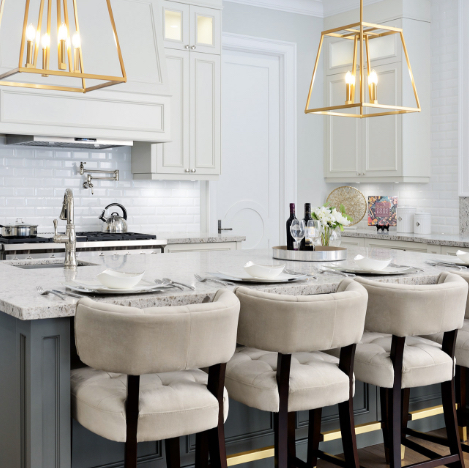
Let Neutral Colours Be Your Base
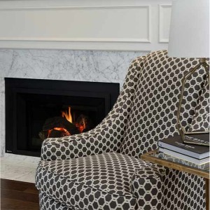
Some homeowners might shy away from large or bold prints, but they can definitely be used tastefully together in a number of ways. As a general rule, it’s a great idea to start with a more neutral colours like greys and beiges on the walls and floor and then use print in other items like area rugs, furniture and textiles that act more like accent pieces. Let them play off other neutral items in the room like large furniture etc, so the bold pattern doesn’t become too overwhelming for the space.
Use Different Scales
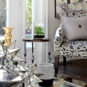
Remember when choosing the prints you’re going to use that you can mix larger, bolder prints with smaller ones so long as they’re in the same colour palette family. Find other commonalities between a more dominant print from larger items like art, furniture or window treatments and then go ahead and choose a smaller scale print for accent items like pillows and other textiles. This variety will make the space more comfortable and inviting!
Mimic Elements From Your Print
 No matter what type of print you love, you can always find way to mic them in a variety of decorative textiles. A bedroom, for example, is a great place to start in since there are so many elements preset. Bedding, pillows, window textiles, lampshades and more can all use different versions of the same print, and you can then use solid coloured sheets, other pillows and even an area rug to provide that balance and prevent the print from becoming too prominent in the space.
Pull Inspiration From The Details
For some, choosing patterns and prints can be difficult, and finding multiple prints to mix together can be bit more trying as well. Whether it’s for wallpaper, window treatments or other decorative items, it can be intimidating to find prints that speak to you as well as play well with other prints. It might be a great idea to choose a piece of artwork and find the colour and patterns from the artwork, and use if to inspire your choices. This is especially useful if your space has a very large piece of art that serves as the room’s focal point.
SUBSCRIBE TO OUR NEWSLETTER
VIEW LATEST ISSUE