Design Advice
Design Trends For Spring & Beyond
 With winter finally winding down and the holiday add-ons to homes now gone for over a month, homeowners may feel like it’s time for a little bit of spring cleaning that may include some design changes to usher in the new season. In many cultures around the world, spring is seen as a time of rebirth and starting over – something that can easily be translated into your space. Heavy rain and the return of flowers and warmer temperatures are things are often associate with springtime, so it makes perfect sense for this to be the perfect time of the year to make changes to your home both big and small. Depending on number of factors, you may be ready for a complete overhaul in the form of a custom renovation, or you may only be in the market for some design and decorating changes that can still make your home feel brand new again. Either way, here are just a few of the spring trends that you’ll see pop up more and more in homes this spring – and beyond.
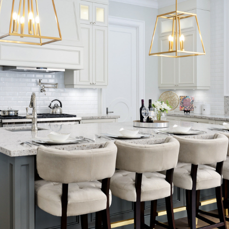
Cool Grey Tones
While grey tones are nothing new for interiors, they previously leaned more to the warm side with hints of beige and other derivatives of brown – creating a type of coziness in a space. The colour dubbed “greige” has been extremely popular over the last few years, but it’s started to make way for cooler versions with touches of blue mixed in, giving it a more pastel effect without going full on baby blue. This is great for nearly any space of the home, and can make spaces feel larger than they actually are. These cool greys are great as foundational colours alongside a wide variety of accent colours and prints. 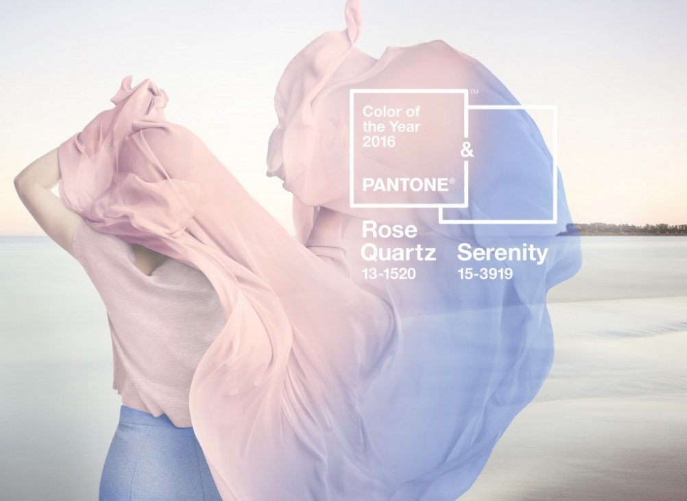
Pastels
It makes perfect sense for pastel tones and shades to be popular for spring – as it’s the range of colours we typically associate with florals. Yellows, pinks, greens and blues will continue to make appearances on their own and together in hushed, muted light hues – providing the perfect backdrop to more vibrant and dynamic colours that serve as accents. This is especially useful for spaces that are largely monochromatic. Using the pastel version of a colour as the base frees you up to play with other versions of the same colour to keep the look cohesive without it being visually overwhelming.
Copper
Accessories, sinks and faucet fixtures, lights and lamps and art are all things showing up in copper this spring; adding an industrial touch to homes in a brand new way. Alongside more traditional metals like stainless steel and chrome, copper works alongside these other types of metals as an accent but can also stand on its own depending on where it’s used. Be mindful of using such an attention grabbing metal in ways they may be overwhelming, and focus on using it in conjunction with other metallic finishes and using it in subtle ways that we’re used to seeing in silver or gold finishes – something as simple as cabinet door pulls.
 Statement Flooring
Gone are the days where we only pay attention to our walls to make a statement, spring is the perfect time to take what’s under your feet into consideration. From glistening wood in various tones and textures, to tile or carpeting in vibrant colours, patterns and prints, let your floors do the talking in your home while letting the rest of the space be a bit more subtle. Don’t be afraid to go bold and don’t shy away from high contrasts – even something as simple as black and white patterned tile can add a bold kick to any room. Because it will take up so much much visual space, make it the focal point of the room and plan the other design elements around it so other items are not competing with it.
SUBSCRIBE TO OUR NEWSLETTER
VIEW LATEST ISSUE