Design Advice
What Prints Will We See More Of In 2016?
 2016 is nowhere close to over, meaning there’s much more time to pay close attention to trends that have popped recently up or carried over from 2015. Prints tend to be an important aspect of any interior, depending on your tastes. They can add tons of visual interest, particularly in monochromatic spaces. It’s also easy to create a motif with just a single print that you can then find different colour and size variations of just to keep it interesting. If you pay attention to balance and connecting elements, you can even mix multiple prints together for even more added effect. Here are just a few of the prints that we’ll see in even more interiors in 201t6.
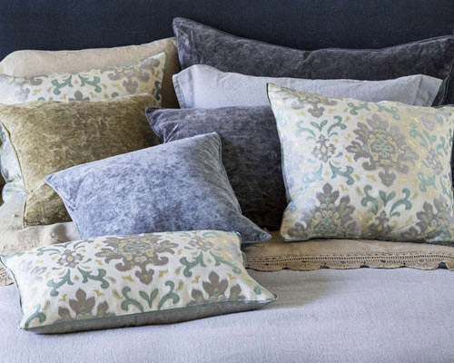
Florals
Florals will continue to steadily make its comeback and pop up in more homes this year than ever before. It will appear in a variety of colours, sizes, flower types and shapes depending on where in the home it appears. From single flowers, lush bouquets to even simpler leaf patterns, prints featuring this natural element will be seen in tons of wallpaper and fabric. Don’t be afraid of bolder, bright and larger prints especially for accent pieces like throw pillows or an accent wall. 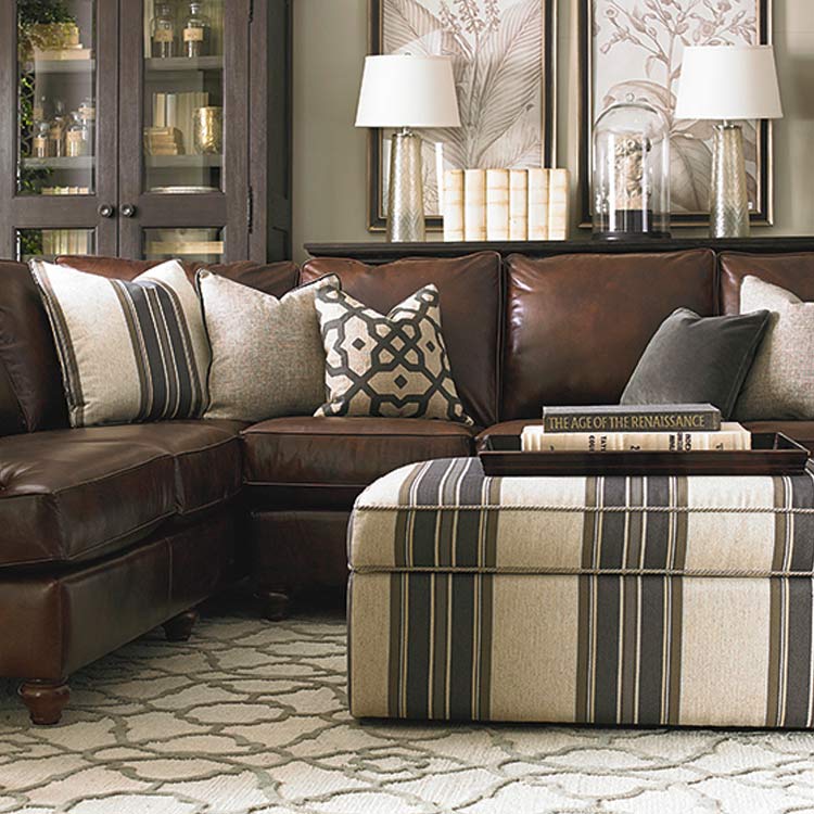
Geometric
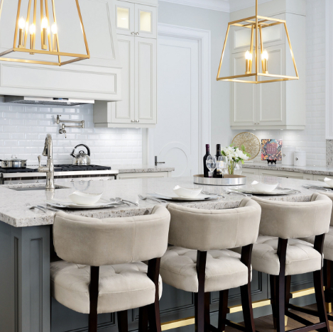
With the prevalence of modern spaces and clean aesthetics, it should come as no surprise that geometric patterns will play an important design role this year. Monochromatic spaces will get a necessary visual boost from the structured, clean lines and shapes as well as more abstract but angular wall art or sculptures. These lines will be the opposite to the organic nature of floral patterns, and you may actually benefit from mixing the two (or others) together in fresh new ways.
Stripes
Stripes never really go out of style to come back, per se, but colour combination and sizes change every now & then. Think of much thicker, equally spaces stripes vs. pinstripes, and don’t shy away from contrasting colours
Blue China
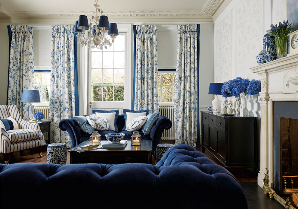 From sculpture to fashion to interiors, blue & white porcelain motifs will be popping up everywhere in 2016. Whether you’re displaying quality flatware sporting the look in your dining room, or used an interpretation of the design on your walls or furniture, it’s a delicate way to bring such contrasting colours together without it looking harsh. With heavy Asian influences, it continues the globetrotter trend of 2015 – injecting pieces of various cultures into your space that mix easily with modern aesthetics.
Mixing Prints
While designers and homeowners might worry about clashing, mixing prints is actually an art in itself. It’s all about finding the perfect balance of colour, size, space and the type of pattern it is to create a space that actually looks cohesive. Sticking to prints that are the exact same pattern can easily make a room look dated and matched up too perfectly, so playing around with even just two motifs can do wonders for mixing it up. Be mindful of using too many or going with prints that have absolutely nothing in common – finding on or more commonalities among patterns that look totally different at first glance is the key to successful pattern mixing.
Don’t be afraid to outside your comfort zone a little this year but incorporating more prints, patterns and textures into your home!
SUBSCRIBE TO OUR NEWSLETTER
VIEW LATEST ISSUE