Inspiration
Make Way For Cherished Gold in 2016
With 2016 finally upon us, this is the perfect time for many homeowners to consider a custom home renovation to completely rejuvenate their homes. Every year tends to also come with style, trend and colour predictions for the next 12 months. Even if you have a pretty clear idea of how you want your space to look, it doesn’t hurt to pull some inspiration from the latest trends. Dulux Paints recently revealed what 2016’s colour of the year would be: a deep, earthy and subtle yellow they call Cherished Gold. A slightly darker take on mustard yellow, the colour works perfectly with other tones, as it’s toned down enough to act as a neutral of sorts. The colour is very reminiscent of gold tones that have become more and more popular in everything from art and fashion, and of course interiors.
With it’s warm base, Cherished works well within palettes of both warm and cool hues – having the ability to play along both lines depending on how much of each colour is used. It’s a tone that plays expertly well with other warm colours like burgundy and brown, but it can also provide a cheery splash of colour in spaces with cooler colours like blue as well as high impact neutrals like
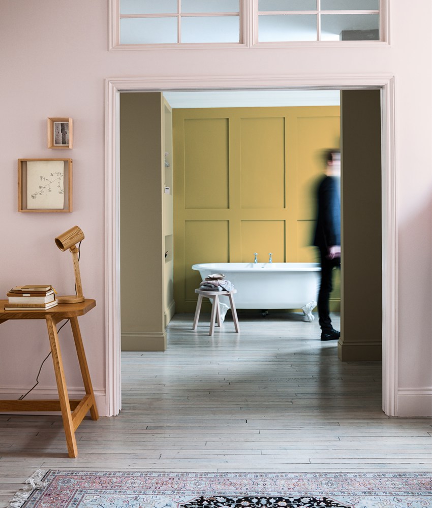
black, white or grey. While much bright variations of yellow tend to clash with any other colour, cherishes is subdued enough to work with a range of other colours, especially if those colours are similarly muted in tone. It would also work well as an accent colour in rooms that are mainly monochromatic like all white or all grey.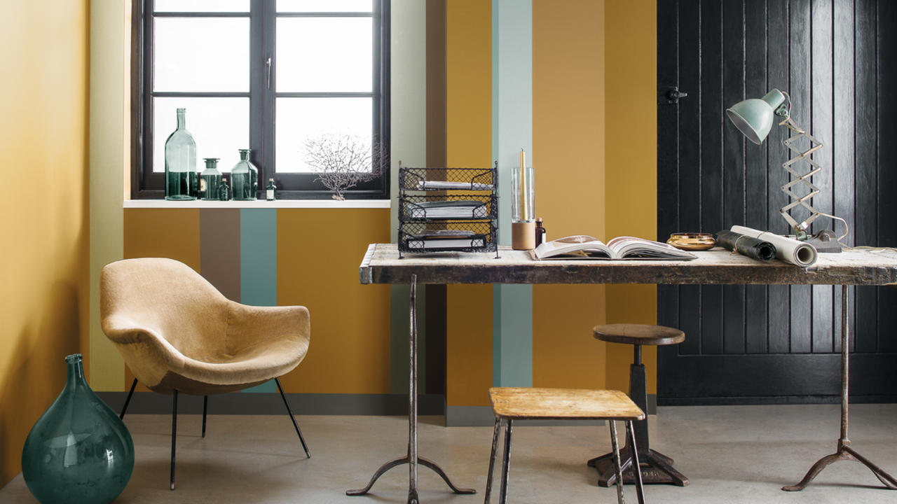
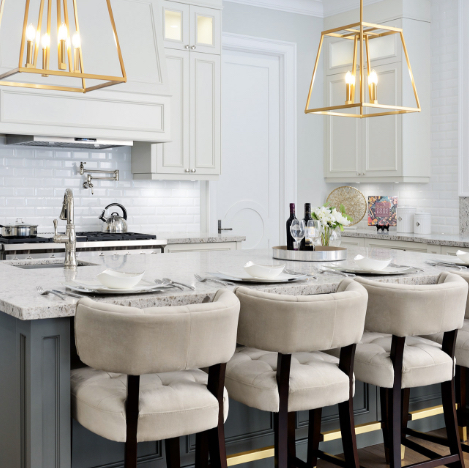
As colour is as psychological as it is aesthetic, keep the purpose of the space in mind when deciding to use this shade. Tones like this one work best in rooms where you’re look to create a cheery atmosphere in a space, making it perfect for kitchens, bedrooms and living rooms. If using the shade on the walls is too much yellow for you, don’t be afraid to infuse the colour with plush furniture or accessories, as it makes a great accent colour. Because of the warm nature of the colour, it works very well in traditional spaces to create a balance between old and new with it’s bright appeal; especially when paired with black & white accents and accessories.
This is also a great colour to have in any room that has lots of vintage inspiration and pieces, as its brown undertones are reminiscent of brass finishes and distressed qualities. Instead of a cream undertone, Cherished Gold has grey elements within in that make it so much more versatile than other types of yellow.
As daunting as infusing yellow in your space may seem, give Cherished Gold a shot after your next renovation.
SUBSCRIBE TO OUR NEWSLETTER
VIEW LATEST ISSUE