Design Advice
Pantone Announces 2016 Colours Of The Year
 Every year, colour authority PANTONE dubs a particular shade as colour of the year meant to guide upcoming trends and collections in fashion, beauty, interiors and more. Following emerging trends and hoping to propel a few more, previous colours of the year have included Radiant Orchid and Emerald, influencing the use of the tones in a wide variety of mediums in their respective years.
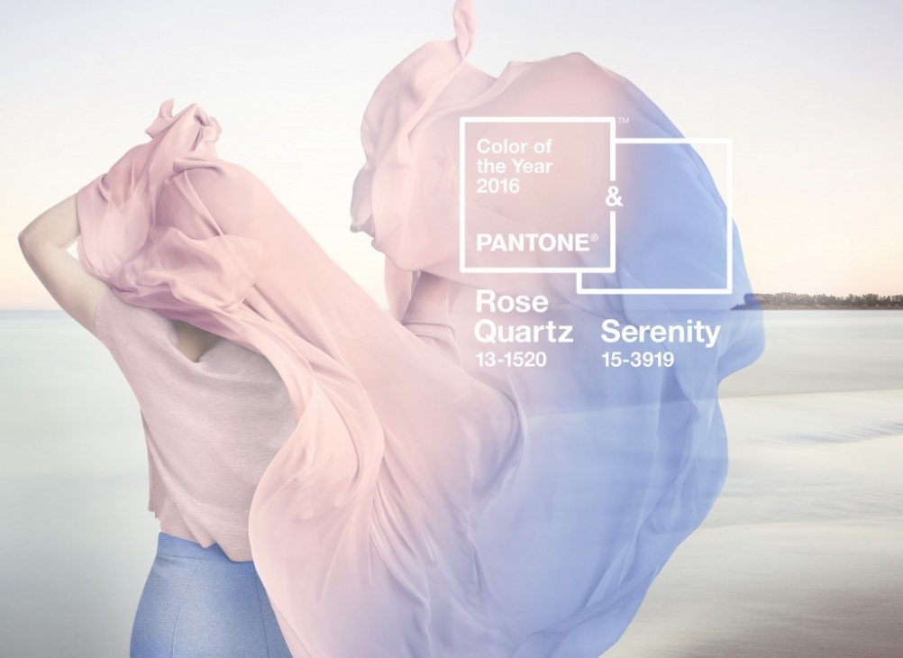
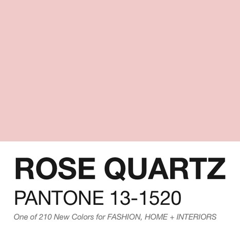
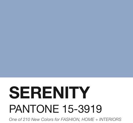
For 2016, Pantone has actually chosen two colours: a blush pink hue called Rose Quartz, and a light blue called Serenity that’s somewhat reminiscent of Chambray. While changing the colour palette of your home on a yearly basis to coincide with the newest annual shade would be a daunting task to say the least, it’s still important to think about ways you can implement that year’s pick into your space – especially if it’s already a shade you gravitate towards and you have a new home renovation or makeover planned in the near future. There’s quite a few different ways you can incorporate a colour in a space beyond just a new coat of paint on the walls (through that’s also a great option.) While existing at opposite ends of the warm/cold spectrum, both pastel shades play well together as well as apart. It’s possible to use them together in a space sine they’re tones that complement each other, be be mindful of the balance between the two. Try to choose one of the colours as the main shade, and the other as an accent hue.
Furniture
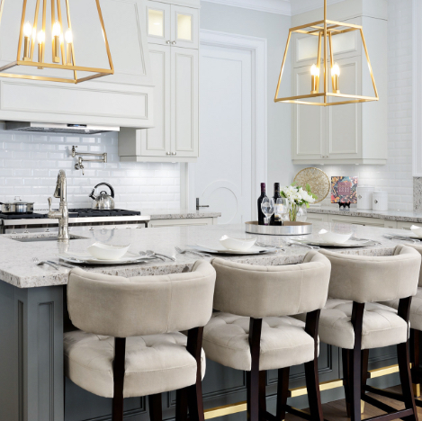
Though Pantone jewel tones are still very popular, pastel toned furniture like these shades still work incredible well for living rooms as well as bedrooms. In parts of the home where comfort and calm is the key, these shades as a perfect match. Serenity will work well in monochromatic spaces alongside other shades of blue, while Rose Quartz furniture pieces
 will fit well in mostly white palettes. Gold accents and detailing bring out the warmth in Rose Quartz while creating the perfect contrast for the cooler undertones of Serenity. Think plush fabrics like suede and velvet, as well as intricate detailing to take advantage of the muted quality of both colours. Larger pieces seem less intimidating when they’re in colours like this, so take advantage of statement pieces.
Walls
Both of these colours could work in multiple spaces in the home, but there’s definitely rooms that they suit more than others. In washrooms, powder rooms and guest bedrooms, Serenity is a great shade to choose. It’s a colour that infers trust and comfort, but holds back on the intimacy that warmer colours convey. That being said, Rose Quartz is perfect for bedrooms, with the right amount of warmth while still maintaining a light, modern and airy feel in the space.
Accessories
Everything from pillows, to sculptures, artwork or other textiles work well in both shades – especially against backdrops that are otherwise all white. The possibilities are endless with both of these shades and you can experiment with textures & shapes of all kinds. Coupled with gold accents and other accessories, these tones say luxury without being too extravagant.
Both Pantone colours work well with nearly any aesthetic, from classic to modern, so it’s easy to put them to good use no matter your tastes.
SUBSCRIBE TO OUR NEWSLETTER
VIEW LATEST ISSUE