Blog
Add Bold Colours to Neutral Spaces
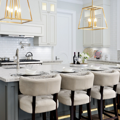
Well-designed rooms are typically cohesive in terms of colour scheme; with tones falling within similar palettes and spectrums to create a succinct flow. Neutral tones are the perfect base for a room, and give you flexibility in terms of adding eye-catching accents in bolder colours, shapes and textures that truly stand out.
Most neutral tones work with just about any accent colour; and with this year’s design obsession with “greige” (a warm combination of grey and beige) the possibilities for accent hues are endless. From pastel yellows, bright sea foam greens to vibrant corals; pairing more commanding colours against a palette of neutral colours like grey, white, taupe, black and everything in between helps details stand out against a more subdued background. Cushions, ottomans, mirrors, photo frames, sculptures, curtains and more will have an extra pop when they’re done in a bolder colour that seems to jump off a toned down backdrop.
Because neutral colours work with virtually any design style, it opens the door for the types of accessories you can incorporate and lets you decide for yourself exactly how these pops of colour will appear in your space. Highly textured fabrics, unconventional shapes and statement-making artwork are also able take center stage and are much more noticeable in neutral spaces, drawing your eyes directly to them when anyone enters the room.
In the end, be sure to choose colours, textures & shapes that reflect the vision and mood you want to create for your space.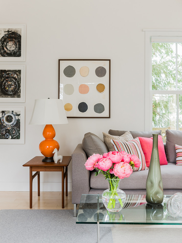
SUBSCRIBE TO OUR NEWSLETTER
VIEW LATEST ISSUE