Blog
Choosing Colours Based On Moods
Choosing a colour scheme for your different areas of your home is extremely important in order to create visual interest in multiple spaces in your home. Of course, your choices of colour should reflect your own tastes, speaking to your personal preferences and the way you want your room to look.
Each colour has a mood associated with it, evoking specific feelings or auras when you’re surrounded by it. Knowing which tones are more closely associated with which moods, or what parts of the brain they trigger is important information to have when making your selection. Though these aren’t hard & fast rules by any means, keeping them in mind could make things much easier.
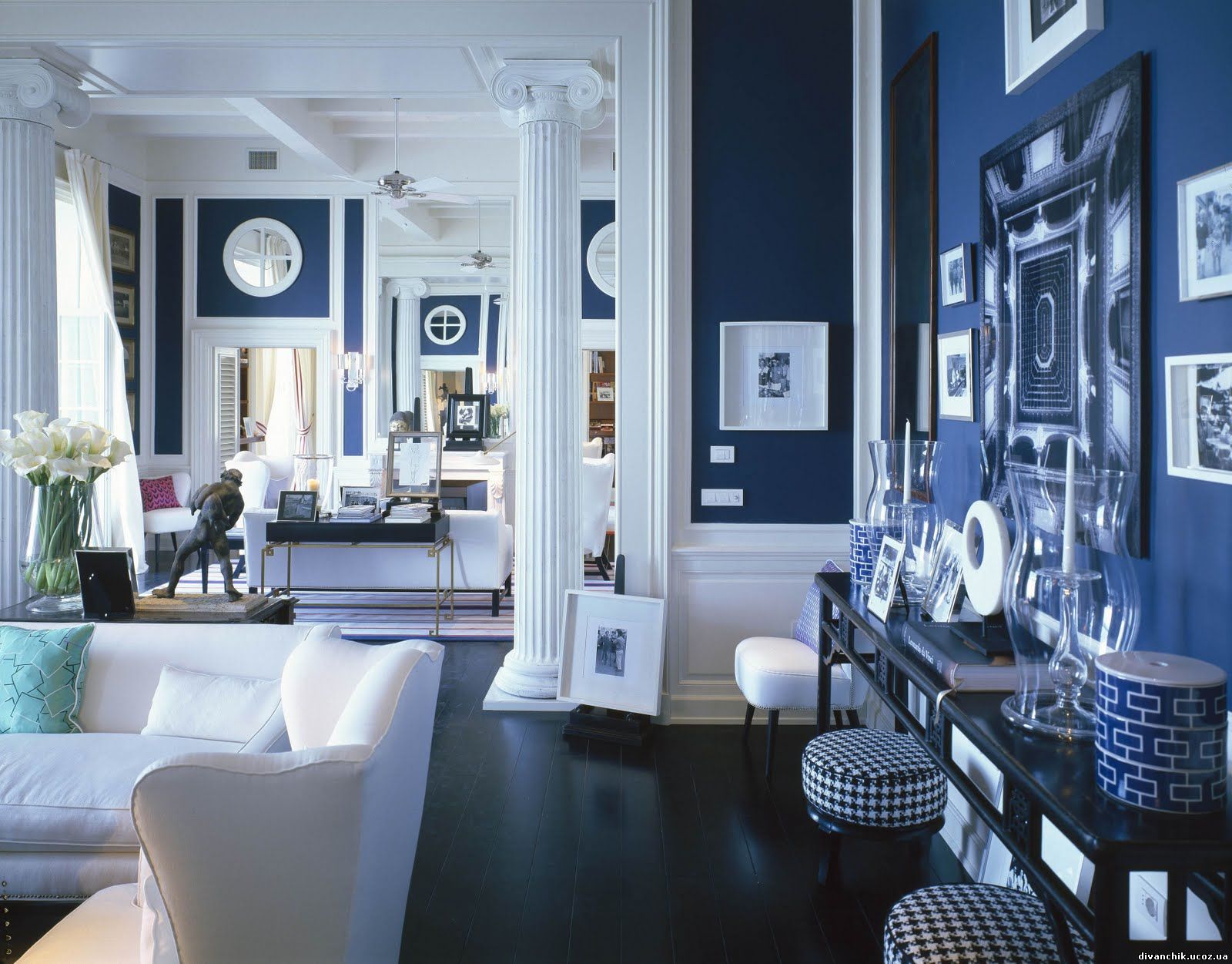
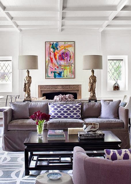
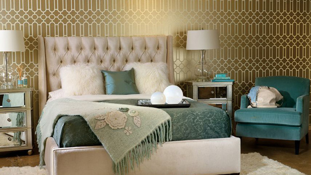
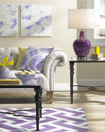
Cool colour generally have a calming effect in a space, making them perfect for bedrooms and home offices or other workspaces. Blues evoke feelings of calmness, spirituality, security and trust, while greens are reminiscent of health and wealth; it’s also one of the most visually pleasing colours to look at in a space and work in almost any room of your home. Not only are various shades of purple associated with luxury and royalty, they also trigger creativity and make for great backdrops in spaces where you would – well, create. As a soothing colour to the human eye, it allows our minds to relax and shed much of the idea-blocking anxiety that comes with creating new things.
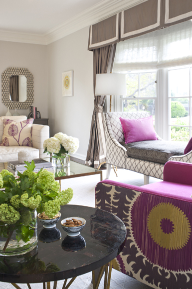
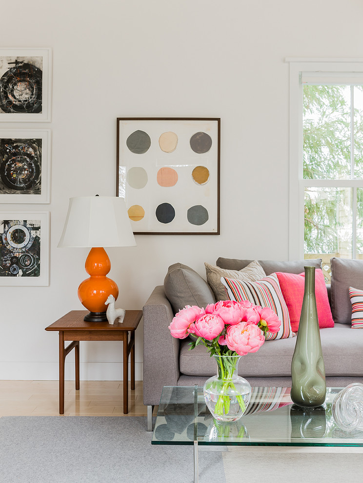
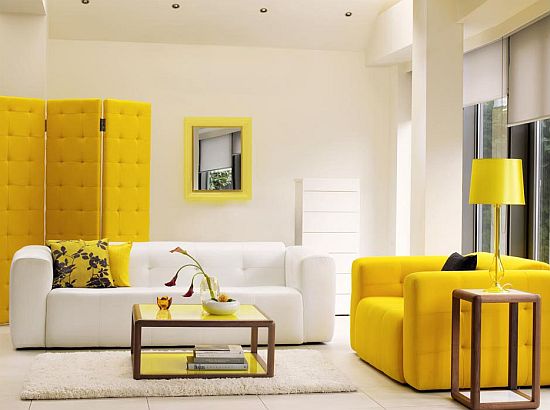
Warm tones are generally energizing and passionate colours, triggering everything from happiness to our appetites. Medium to deep reds often make us hungry, making them perfect for eat-in kitchens and dining rooms. This is also the reason why many fast food brands have red included somewhere in the logo, along with oranges, yellows and browns that add to the effects. Yellow is closely tied to hope and cheerfulness, making them perfect for nearly any room of the house, but especially living rooms, recreational spaces like play rooms and kitchens. Orange is another colour that can invoke feelings of happiness and energy, feeling inviting as well as friendly. This makes it a great colour for living rooms and large kitchens if you normally do much of entertaining there or it’s the social centre of your home. Be cautious with the shades of the warm colours you use, as they can be irritating to the eye. It may be best to use muted tones of each and use them as accent colours as opposed to entire wall coverings.
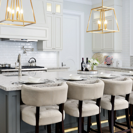
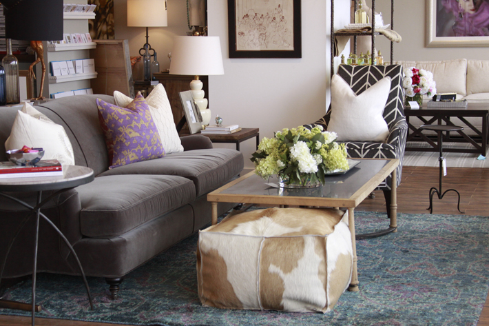
Neutral colours like black, white, brown and beige can have varying effects on us, relying mainly on accent colours or styling to shift our perception or feeling within the space.
Depending on the mood you’re going for, choose a colour that reflects not only what you want to see in a room, but what you want to feel.
SUBSCRIBE TO OUR NEWSLETTER
VIEW LATEST ISSUE