Design Advice
Design Rules To Break in 2016
With most forms of visual art (and interior design is definitely an art!) there’s artistic rules that govern colour pairings, palettes, balance and more. While some of those rules help prevent spaces from looking cluttered or discombobulated, some are still too rigid to accommodate the changing tastes of homeowners and evolving styles. Here are just a few design rules you should consider breaking in 2016.
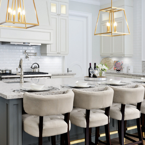
 Don’t Mix Metals
Metals tend to exist separate from each other and especially in kitchen spaces the dominant type in most homes tends to be chrome, but in 2016 don’t be afraid to try different metal finishes together in the same space. Gold, rose gold, copper, and antique silver all have a place in the home and in the same space. Try kitchen fixtures with a finish other than chrome and don’t be afraid to mix different metallic items like framed mirrors, wall art, vases and mantle accessories to create a diverse look.
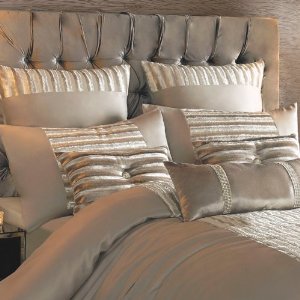
Don’t Mix Prints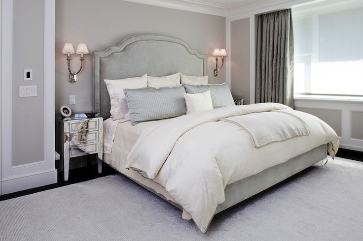
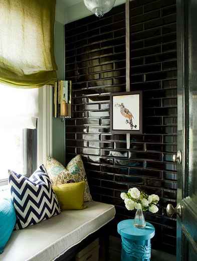
Just like mixing metals, common wisdom says mixing prints means clashing and creating visual confusion in a space, but depending on the types of prints you’re using, they can successfully exist in the same space while still looking like they belong together. The key is to have a feature that links the difference prints together in some way, either in colour, texture of the print style itself. You can build on one bold print and have smaller iterations of the same type of design in other items, or try completely different pattens with the same colour palette to still bring them all together. Once you find the strong link between all the items and mix them all in with similarly toned solid pieces, you’ll see how well multiple prints and patterns can work together.
 Always Have An Accent Colour
Even in minimalist spaces dominated by a single colour, we still feel the need to have an accent tone that ties accessories together out of fear that the room will appear bland and uninspired, but a completely monochromatic is the complete opposite. You can create a visually appealing space using only one colour, or similar tones of the same shade, without having to consult the colour wheel to find and make us of its direct contrasting tone. No matter what colour you choose, you can find a way to stick to that colour palette in any space without the need for an opposing colour along with it. You can pair these colours with neutrals that may appear in patterns and prints, but don’t be afraid to commit to a colour if that’s how you want your space to look. All white spaces create serenity and a feeling of fresh airiness while a taking on a monochromatic blue look will create a calming aesthetic in a room.
Tiles Are Only For Kitchen & Bath
SUBSCRIBE TO OUR NEWSLETTER
VIEW LATEST ISSUE